A chip off the old Soviet bloc.
KUCHNIA & KELLER
Comfort food in Nashville is usually a meat and three. But at Kuchnia & Keller, comfort food is more goulash than greens.
SERVICES
Identity
MERCHANDISE
ENVIRONMENT
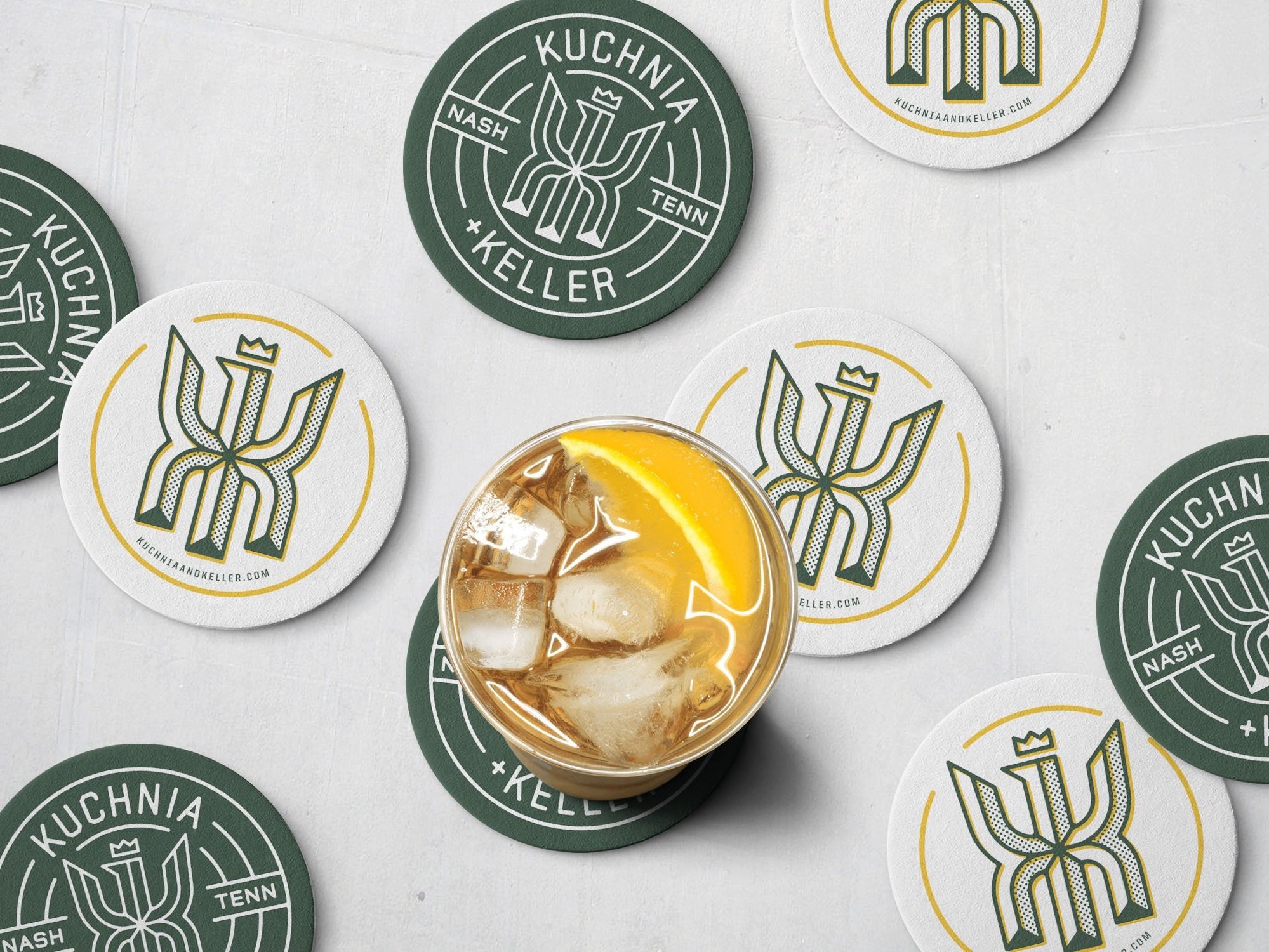
DigitalKuchnia + Keller means “kitchen & cellar” in Polish, so we pushed the two K’s back to back and crowned them, as an homage to the distinctive splayed eagle on the Polish flag.
Raised in Milwaukee, Chef Aaron Clemins was inspired by the Polish and German butchers, bakers, and barkeeps that were mainstays in most neighborhoods, bringing comfort and camaraderie to locals during the long, cold winter months.SIGNAGE
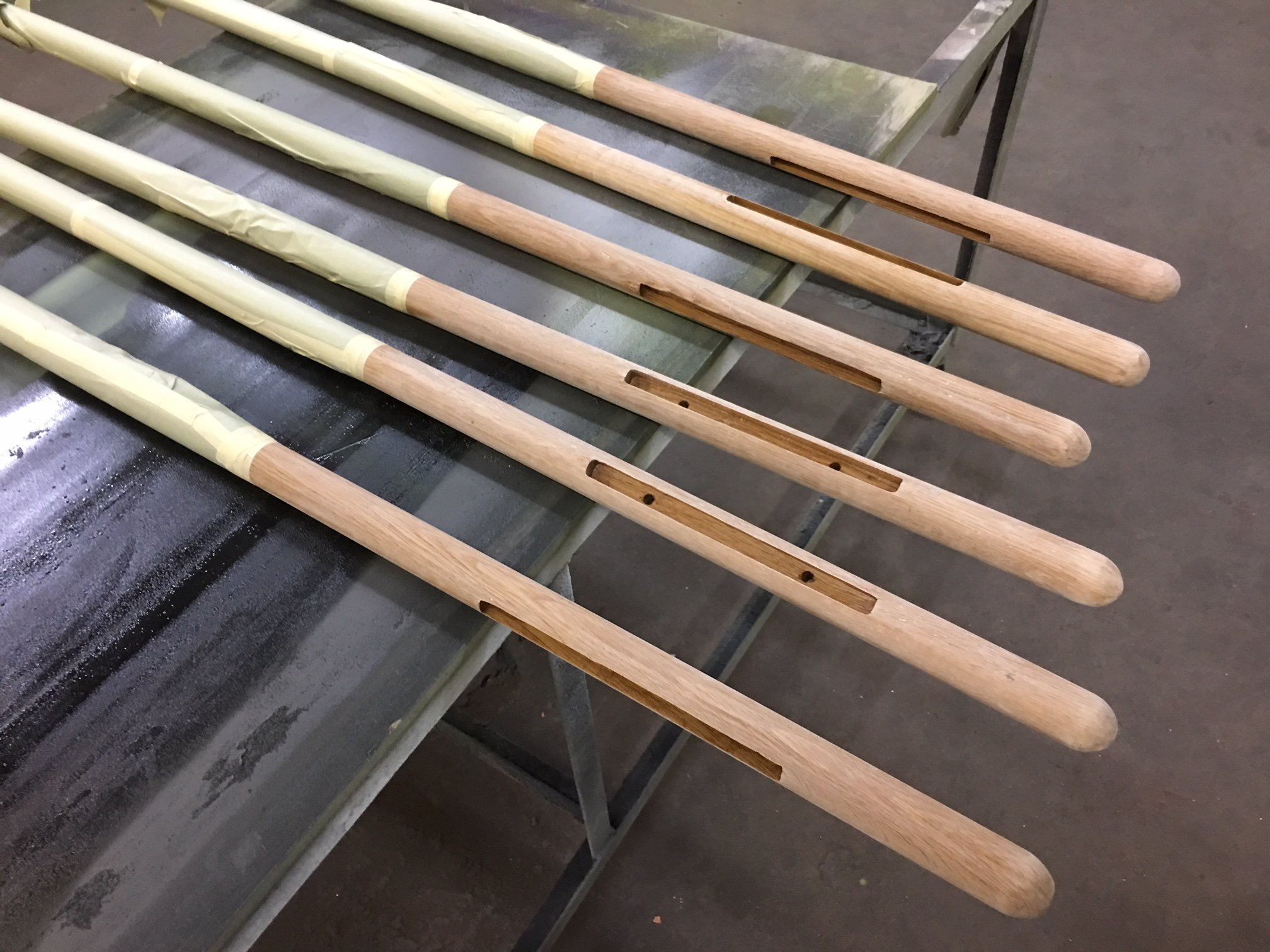
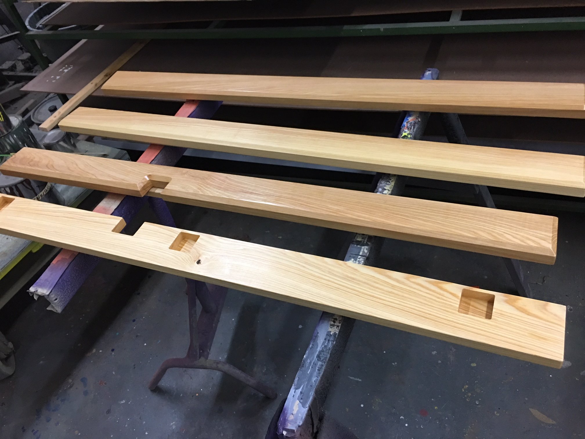
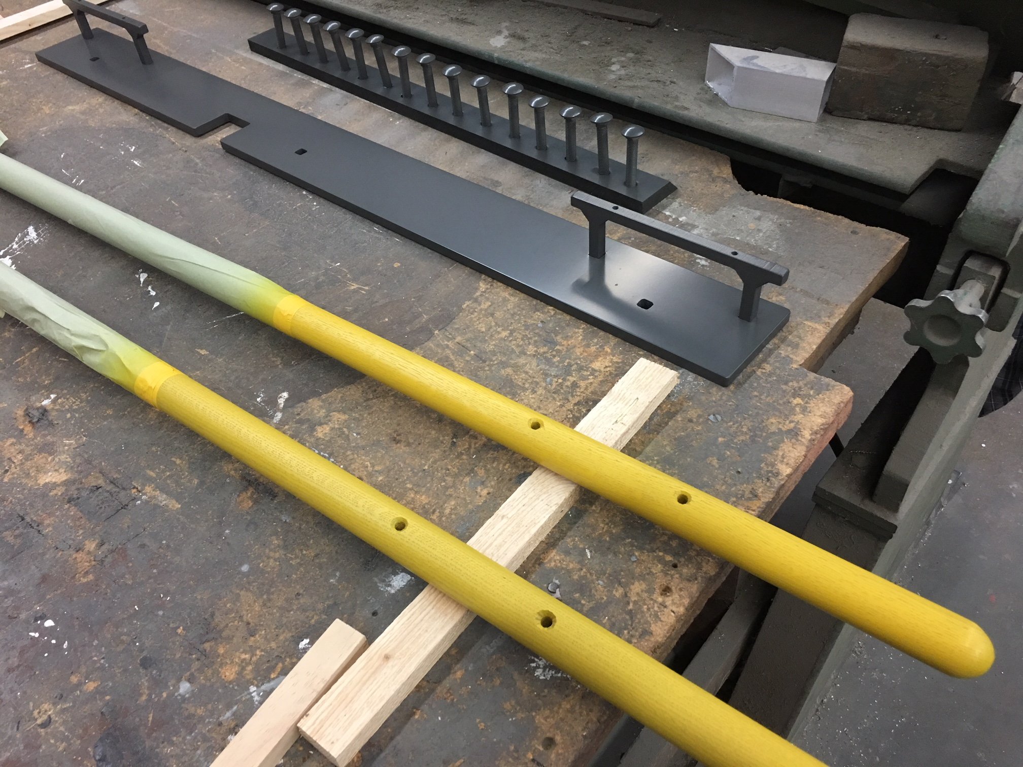
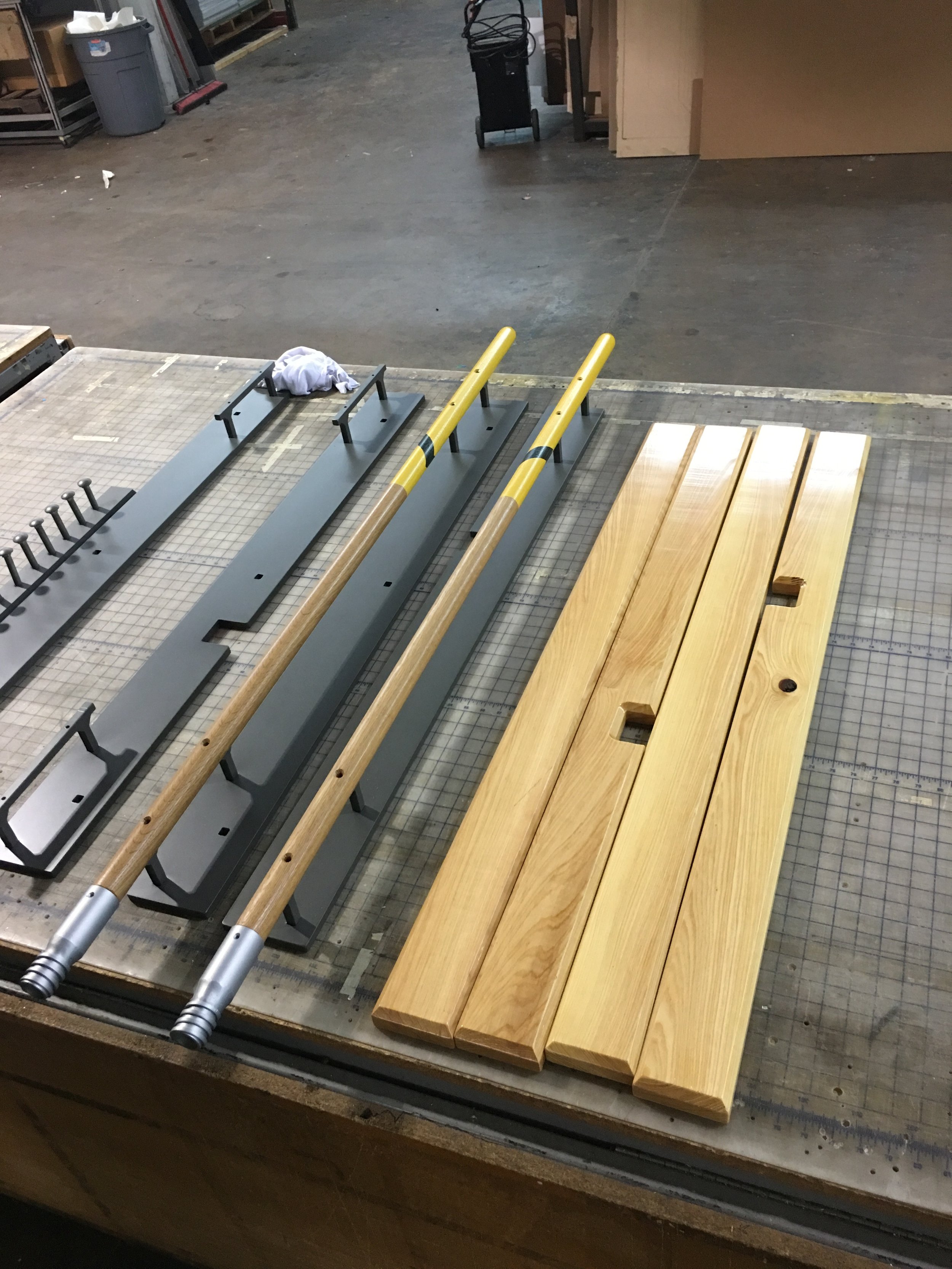
What better way to highlight history than to touch it each time you enter the building? Kuchnia + Keller's custom door pulls serve as an homage to the broom factory that once occupied the space.
WEBSITE
We created a fully responsive website for Kuchnia + Keller to show off their tasty food photography as well as make the menus and location easy to find. By mimicking the the brand’s print goods, the website’s menu feels cohesive from first checking it out online to when you sit down to actually place your order.
MENU SYSTEM


