

Now Boarding.
CROSSTOWN CONCOURSE
From the past to the future, with only one stop in between, Crosstown Concourse is on track to change the core of a city.
For over 60 years, the Sears Crosstown building was 1.5 million square feet of bustling commerce in a thriving community.
By 2010, it had turned into an eyesore primed for demolition, in the middle of a neighborhood that tried not to notice it anymore.

Five years later, a group of dedicated citizens, along with an unprecedented 30 outside public and private funding sources, came together to save this historic building and the blighted urban core that surrounds it.

Before renovations, we were tasked with telling a new story and creating a new identity for the massive structure. We Crafted a brand platform based on discovery sessions conducted with all key players in the redevelopment, which led to assigning the project its archetype: the Magician, who represents limitless possibilities.Armed with a new mission, voice, and an overriding creed— “We are better together”— we chose a new name for this iconic landmark: Crosstown Concourse.


A concourse is essentially an openly accessible area that anyone can traverse in order to make it to another destination. With this one word, we were able to illustrate the equitable nature of the new development and its promise of becoming a different kind of hub in Memphis.
SIGNAGE

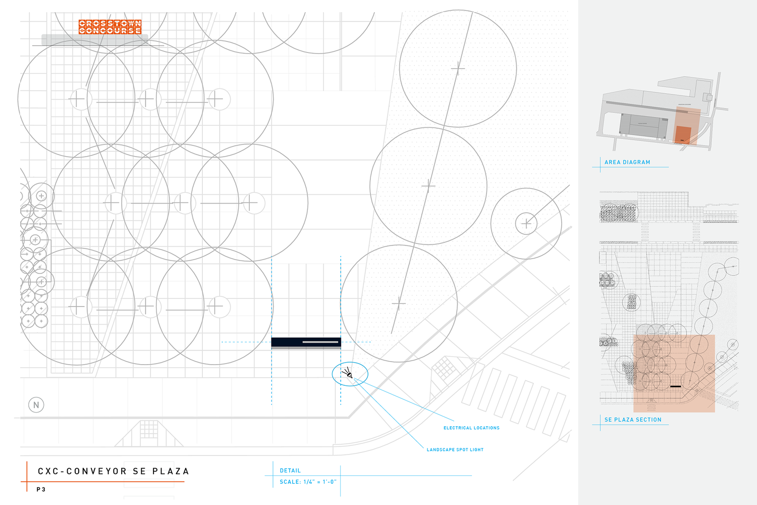
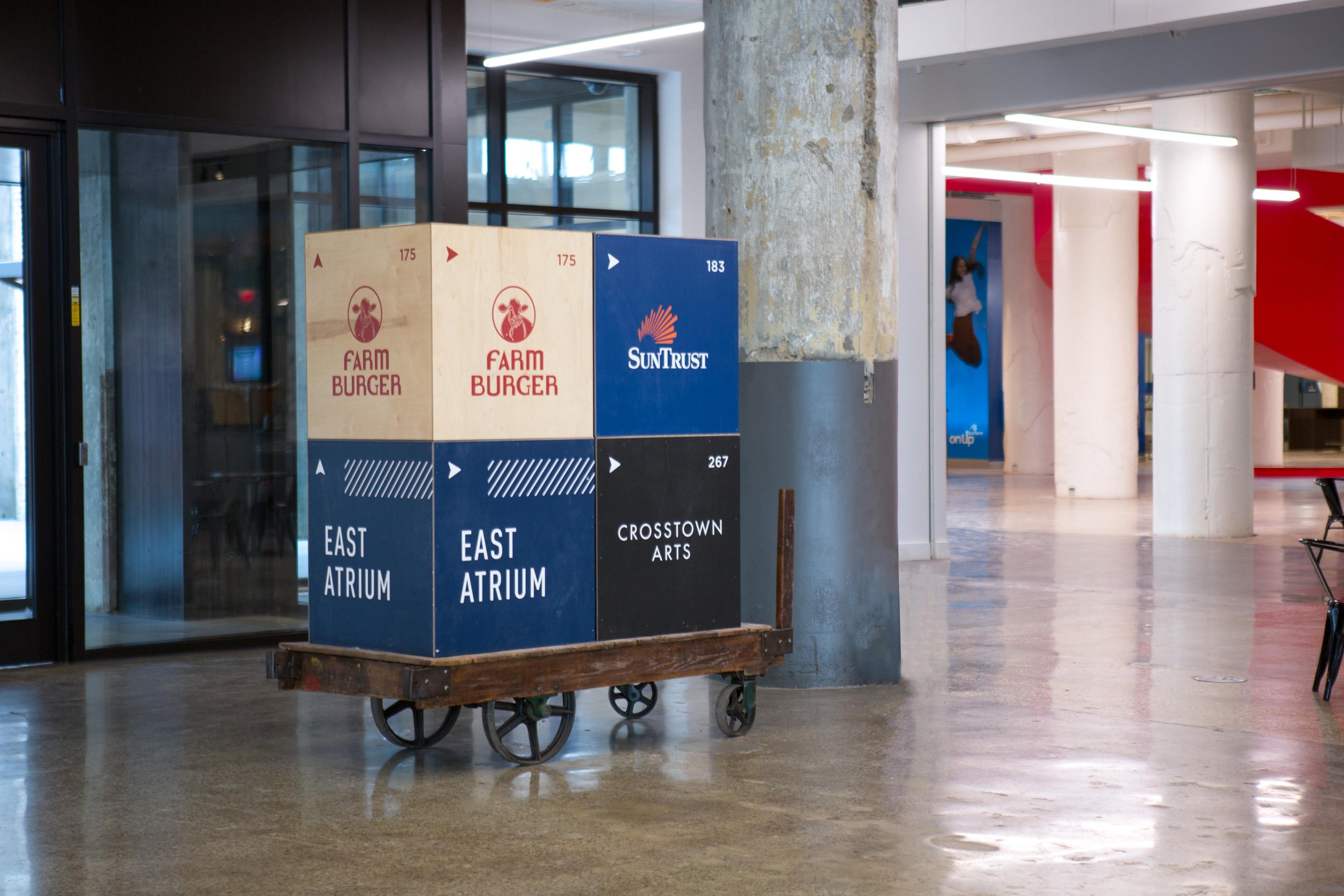
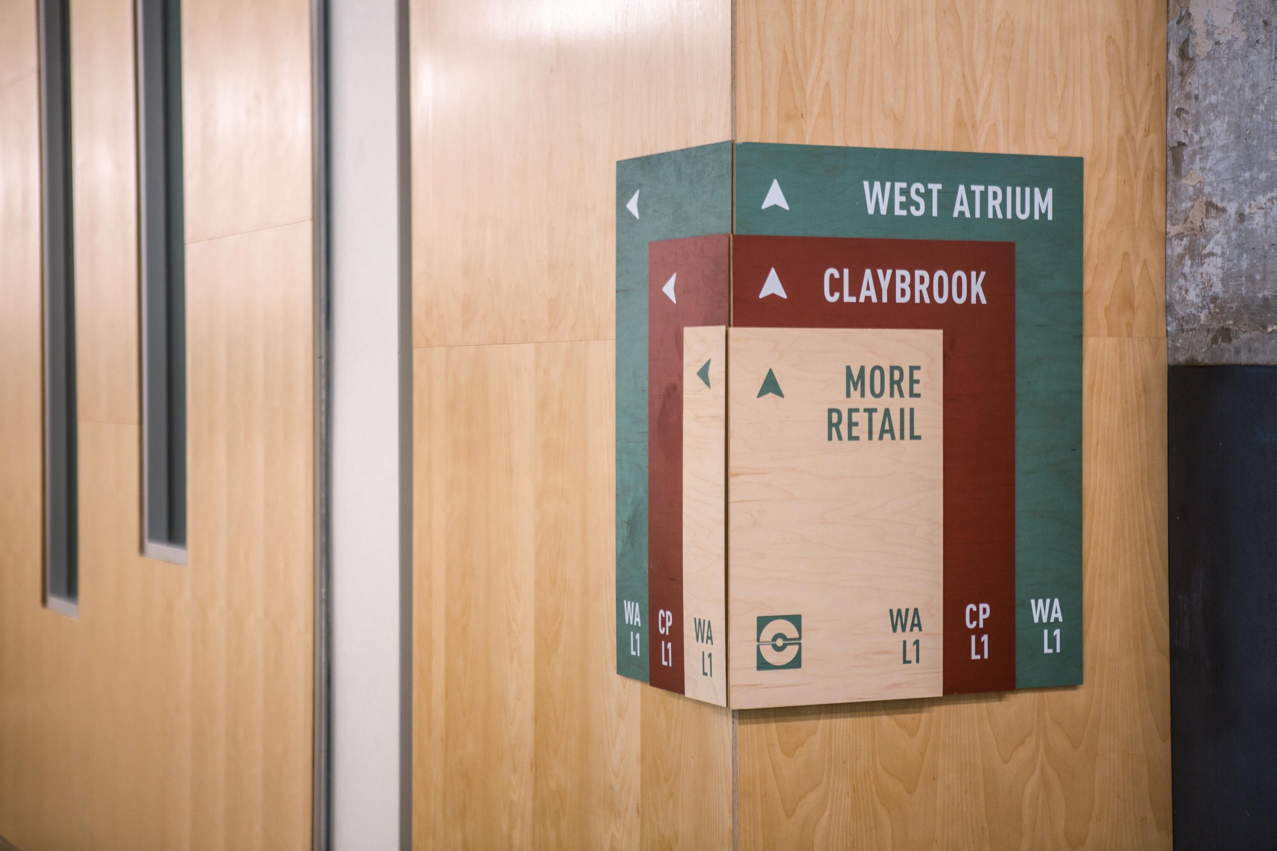
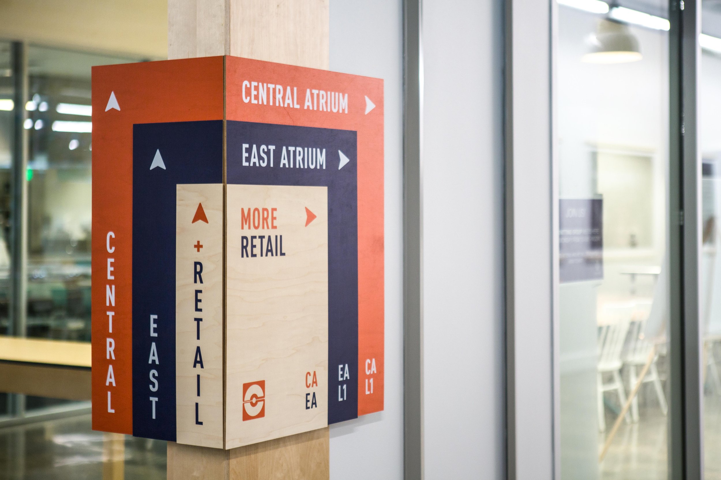
Navigating a 1.5 million square foot facility is no easy task and can be quite overwhelming. To tackle this problem, we created a multi-layered wayfinding system.
Through atrium specific directories, directional crates perched on original inventory carts throughout the building, and custom iconography, Concourse visitors can easily explore any given area of the massive building without intimidation.


Subtle fun messaging on sometimes mundane signage adds to Concourse's unique unexpected moments. We provided familiar pop culture messaging for each individual stop sign on campus.


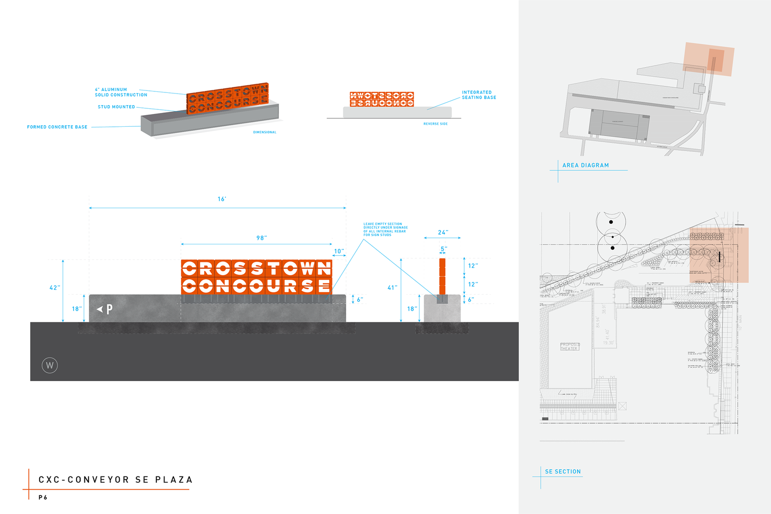
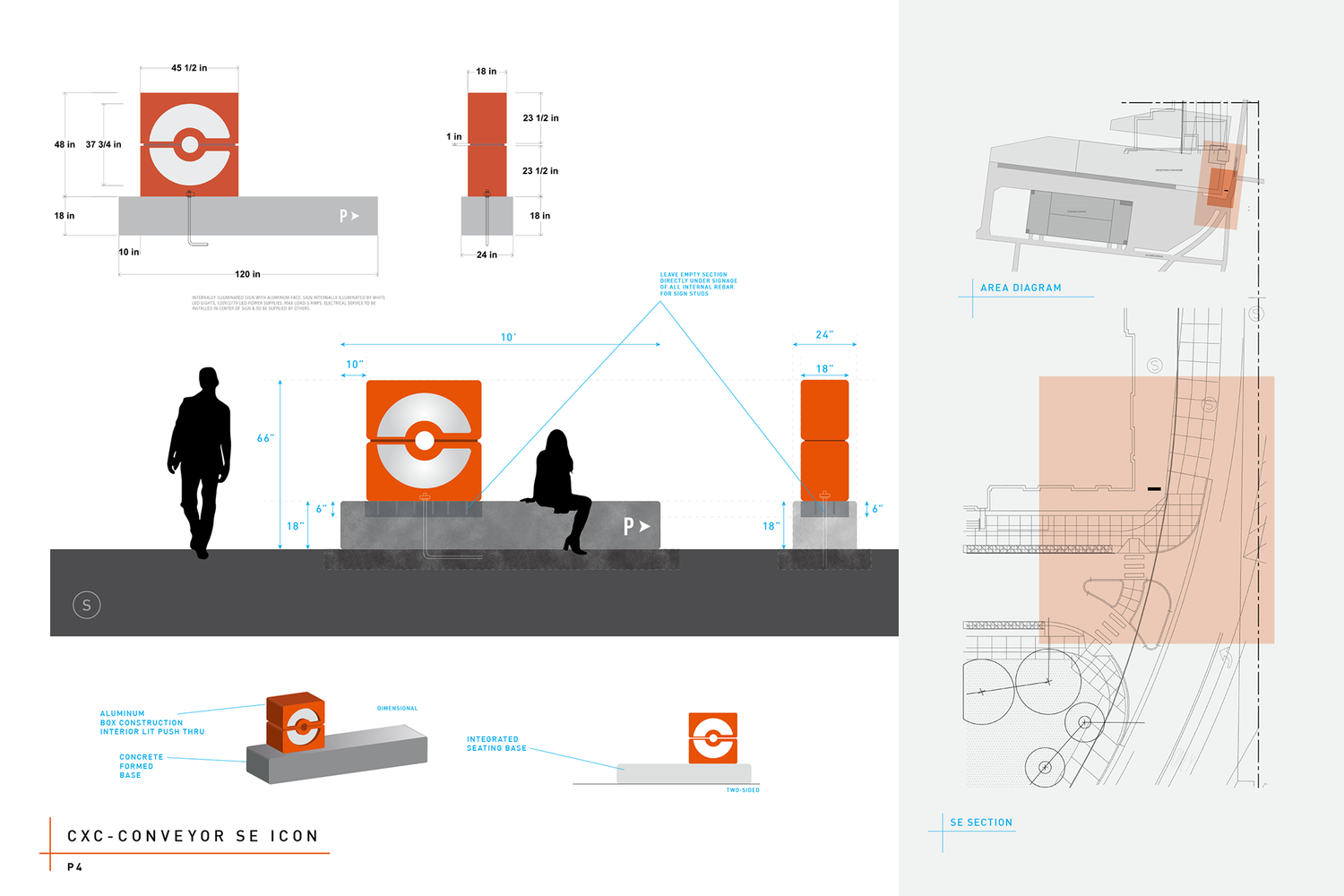
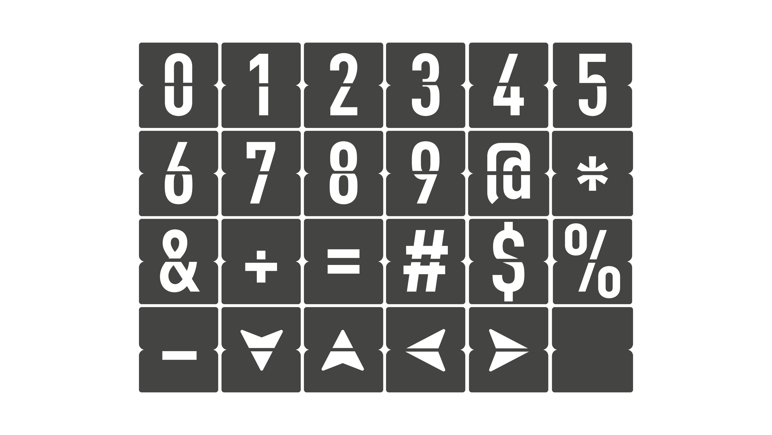
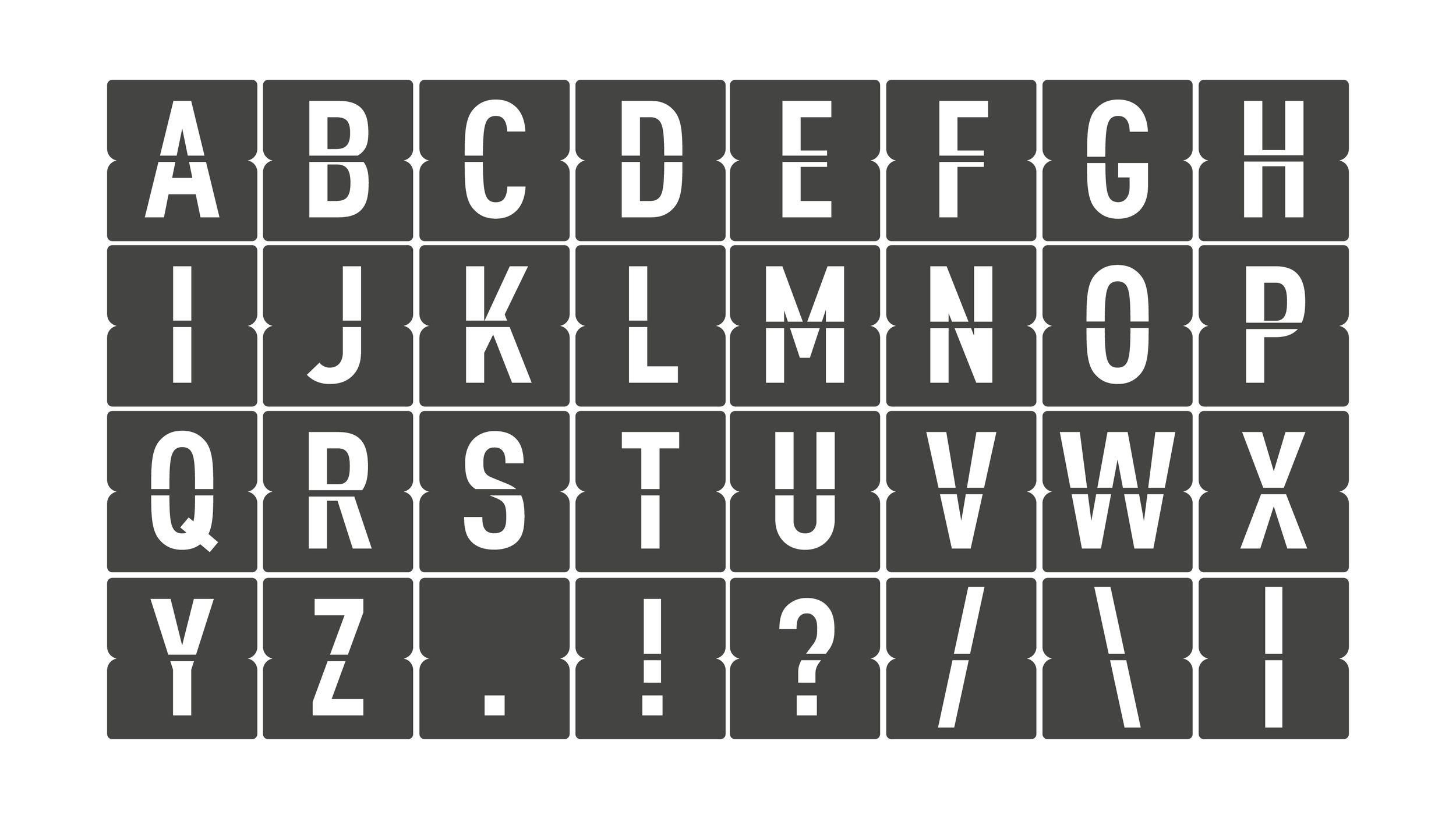
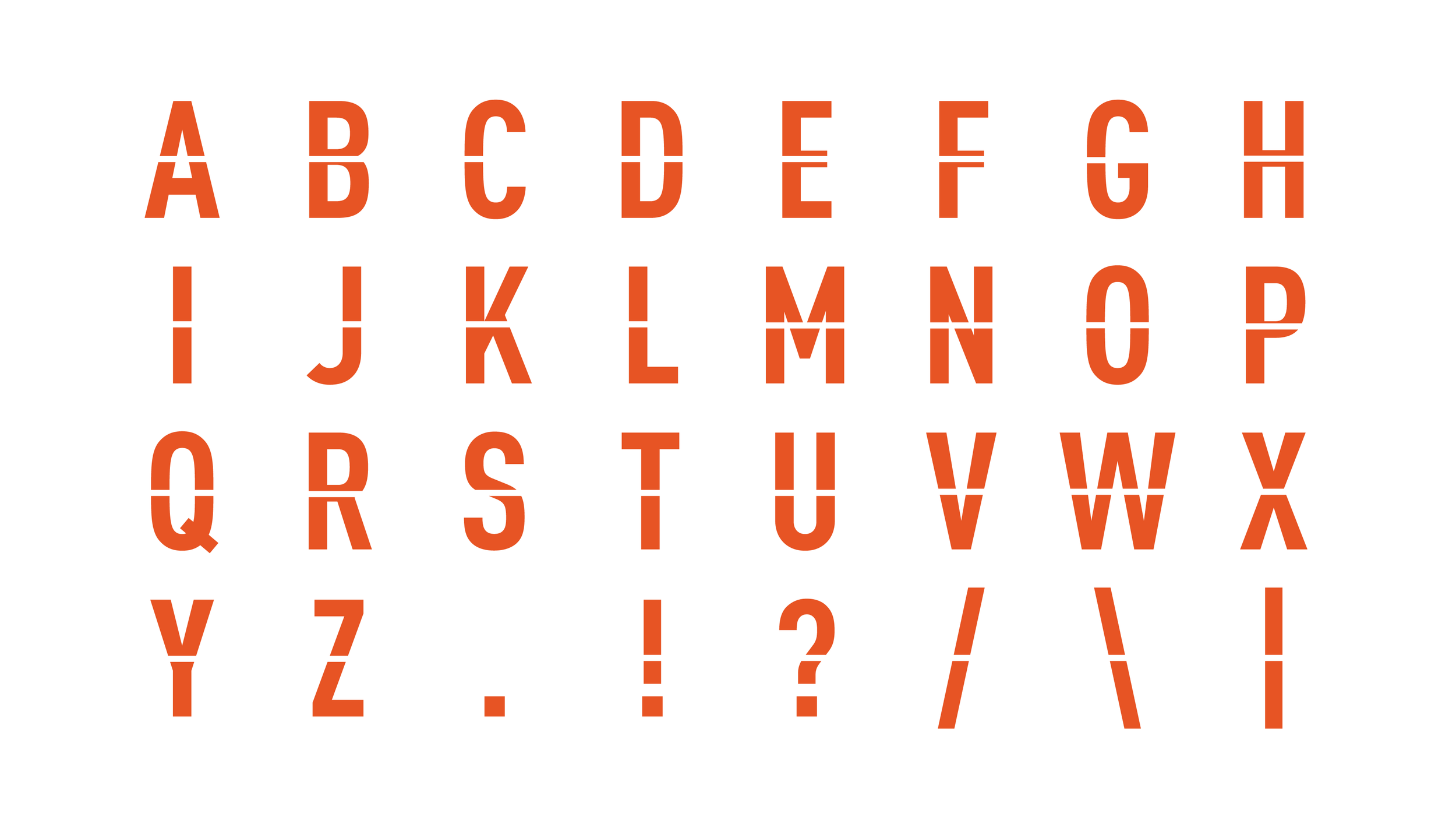
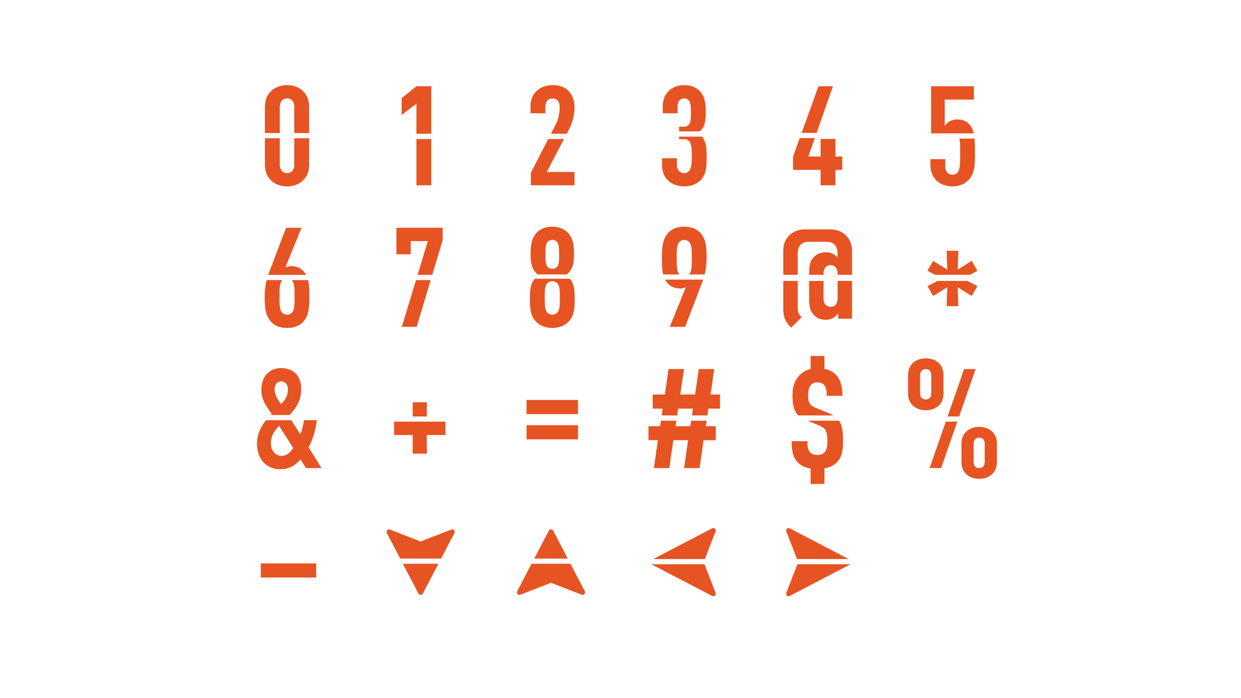
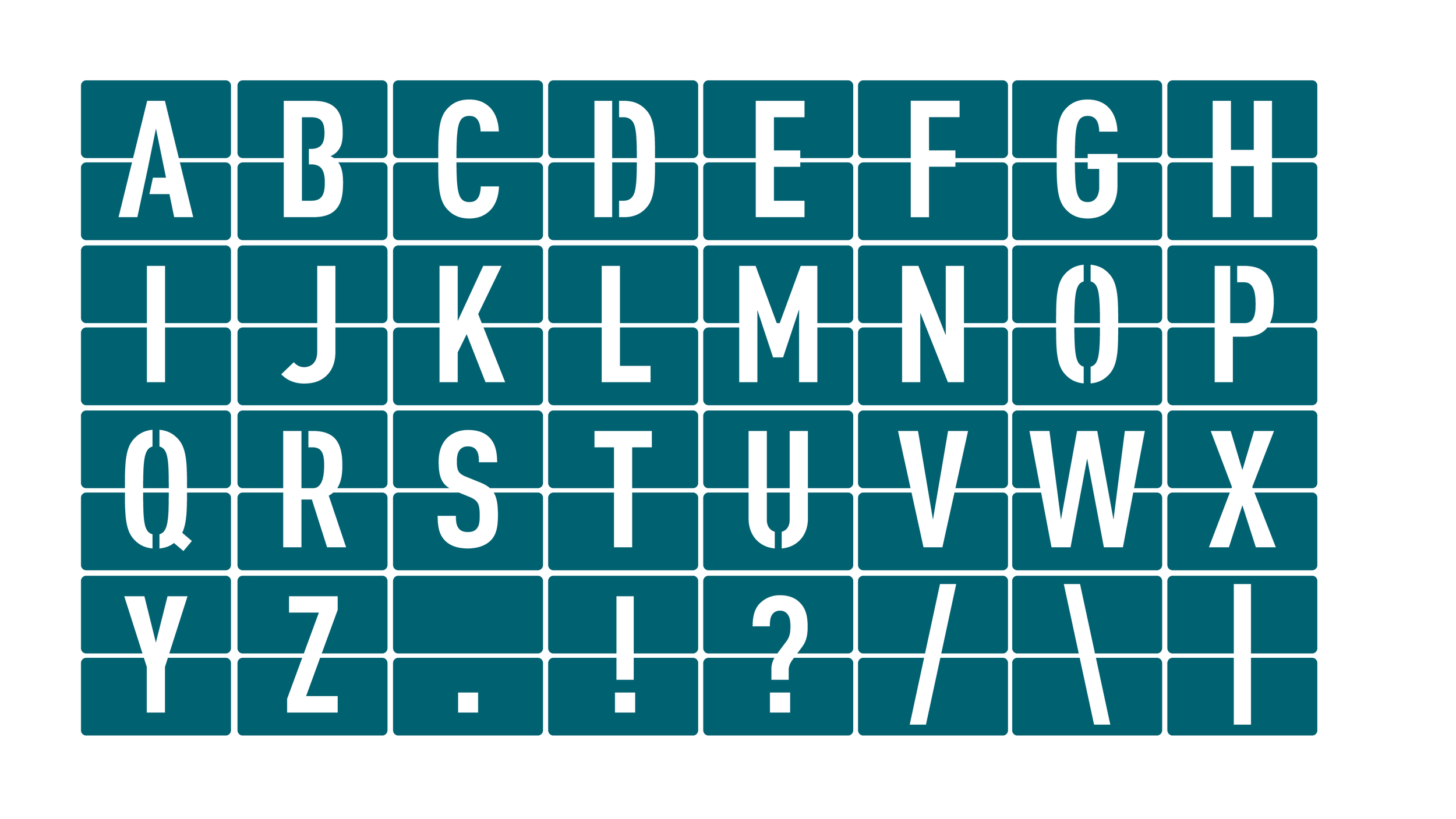
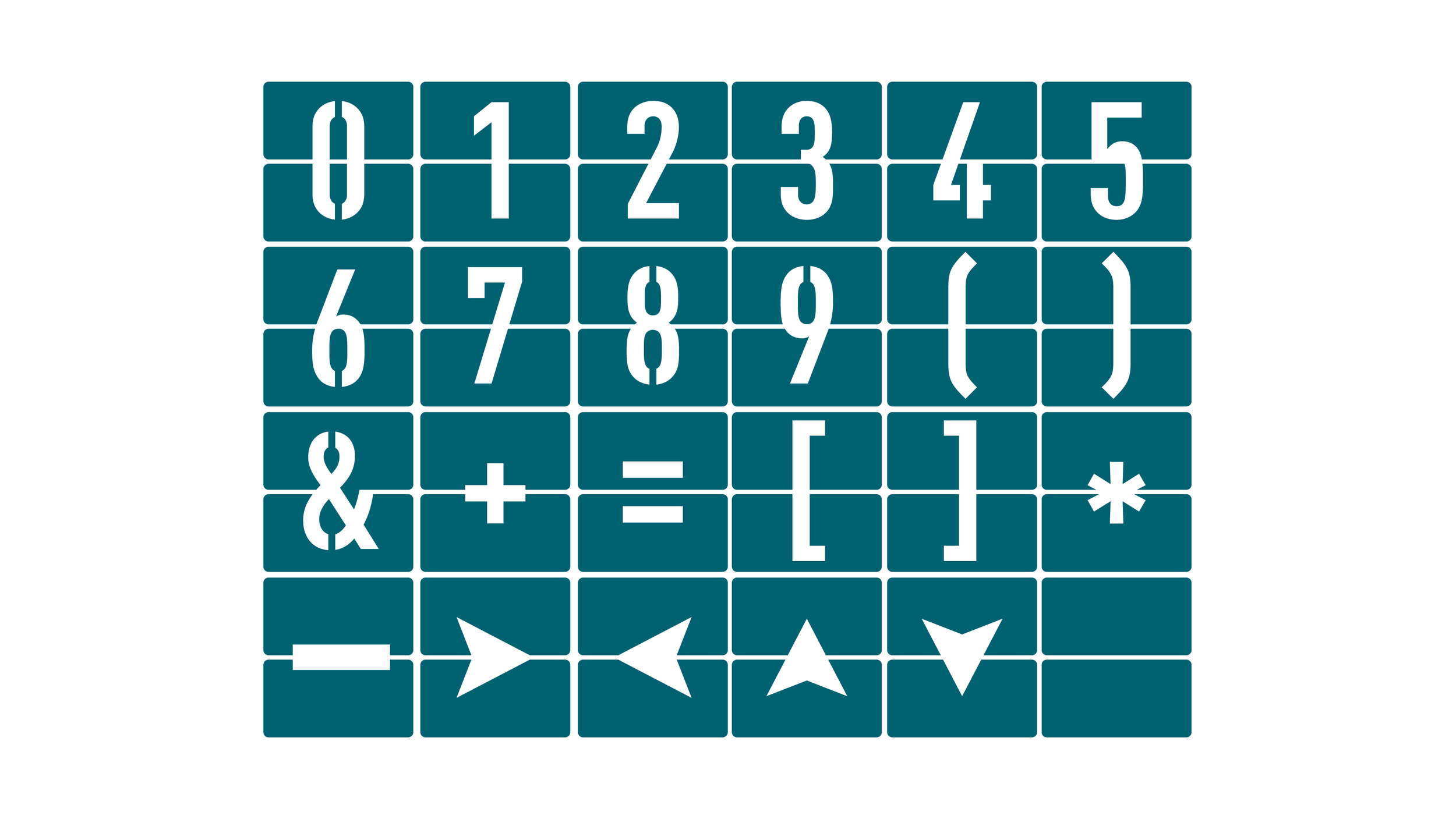
The name Concourse also allowed us to take universally recognizable travel components— such as the flipboard letters in a train station— and combine them with bold paint colors found in the original building to create a visual identity fitting of the “historically modern” development.


The parking garage signage that formerly read SEARS in hexagonal letters was reproduced with a Concourse twist, reading now as YOURS. At night, the Y flickers off and on, a signal to the outside world that “what’s ours is also yours.”


WEBSITE VERSION 1
Eventually, the website needed to evolve along with the building from an experience based on staying up to date with construction, leasing opportunities, and learning about the project’s beginnings to a full-fledged marketing tool for Concourse visitors, tenants, and residents.
WEBSITE VERSION 2
This entirely new website became the backbone of a marketing campaign focused on Concourse being a central hub for the neighborhood and the city that highlights all the ways to #MakeYourConnection.


SOCIAL / NEWSLETTER
The Conveyor is the continuation of the former employee newsletter in the Sears Crosstown building, which was in circulation for over 40 years. Each monthly Conveyor email blends the building’s history with the building’s future, sating our audience’s nostalgia and, concurrently, their desire for updates on the new development.


The Concourse story - its journeys, destinations, and arrivals - is designed to center the experience of Memphians who aspire to be better together.


